

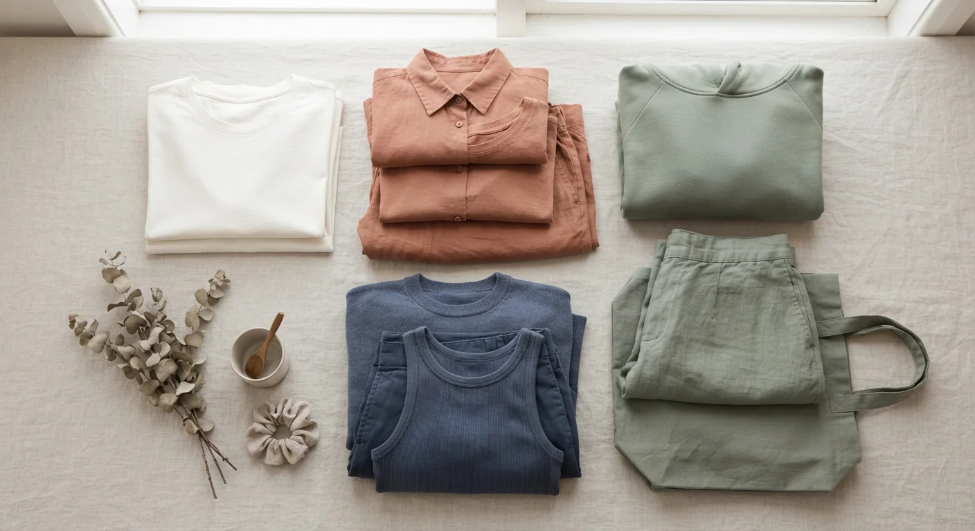
Key Takeaways
- The color wheel provides a reliable, structured framework for building harmonious outfit combinations.
- Neutrals function as anchors that let bolder colors breathe without creating visual noise.
- Tonal dressing - staying within one hue family - is one of the most forgiving approaches for beginners.
- Value contrast (light versus dark) matters as much as hue when putting an outfit together.
- Limiting an outfit to two or three colors consistently produces cleaner, more intentional results.
What you will need
Why Color Coordination Feels Harder Than It Is
Most people treat color pairing as instinct - something you either have or don't. In reality, the combinations that reliably work follow consistent, learnable principles used by designers, stylists, and artists alike. Understanding even a handful of these rules removes the guesswork from getting dressed.
The foundation is the color wheel, a circular diagram organizing hues by their relationships to one another. Colors directly opposite each other are called complementary pairs - think blue and orange, or red and green. Colors adjacent to each other are analogous - yellow, yellow-green, and green. Both relationships produce combinations that feel intentional rather than accidental, for different reasons.
If you're building a wardrobe from the ground up, it helps to understand how individual pieces interact before layering color choices on top. See our beginner's wardrobe guide for the core principles of assembling a flexible closet.
Patterns Already Contain Color Palettes
If you own a printed or patterned piece, look at the colors already in it - those are your pairing options. Pulling a solid in one of the secondary colors from a pattern creates automatic coordination without any extra analysis. This approach works especially well with stripes, florals, and plaid.
How to Apply Color Rules to Real Outfits
Knowing the theory is one thing; applying it while standing in front of a closet is another. The steps below translate color principles into a practical process you can use any morning.
Start with a neutral base
Choose one neutral piece - black, white, grey, navy, camel, or beige - as the anchor of the outfit. This piece will carry the most visual weight and give other colors somewhere to rest against. Bottoms and outerwear are natural starting points because they cover the most surface area.
Introduce one main color
Layer in a single non-neutral color on top of or alongside your base. At this stage, the goal is simply to identify which hue you're working with. The specific shade matters - a dusty rose behaves very differently from a hot pink, even though both are technically the same hue family.
Decide on your color relationship
Determine how you want the outfit's palette to behave. Three reliable options:
- Tonal: Stay within the same hue family, varying only in lightness or saturation (pale blue shirt, mid-blue trousers). Cohesive and understated.
- Analogous: Pick hues adjacent on the color wheel - rust, terracotta, and warm brown, for example. Harmonious and low-contrast.
- Complementary: Pair hues from opposite sides of the wheel - cobalt blue with a burnt orange accessory. Higher contrast and more visually dynamic.
Check value contrast
Value refers to how light or dark a color is, independent of its hue. Squinting at an outfit in the mirror - or taking a black-and-white photo - reveals the value contrast. An outfit with no value contrast (all mid-tones) can look flat. One with too much (all extremes) can look harsh. Aim for a mix that reads clearly at a glance.
Limit the palette to three colors maximum
Count the distinct non-neutral colors in the outfit. If the total exceeds three, remove or swap one element before finalizing. This is not a rigid rule, but it reflects how most successful outfit combinations work - a constrained palette reads as deliberate, while an expanded one risks appearing unresolved.
Once you're comfortable pairing two colors confidently, neutrals become the tool that holds the whole system together. Neutrals like navy, white, grey, and camel act as connective tissue - they absorb color without competing with it, making even bold combinations feel grounded. A wardrobe anchored in well-chosen neutrals gives you far more pairing options than a closet full of competing statement pieces. For a deeper look at which items create the most versatility, our guide on wardrobe foundations covers what makes each piece genuinely adaptable.
Beware of Matching Too Precisely
Exact color matching between pieces - a top that's the identical shade as a bag, for instance - often reads as overly studied or costume-like rather than polished. A slight variation in shade or finish within the same hue family tends to look more intentional and sophisticated than a perfect match.